Apply UXDL: Course Navigation
Course Navigation
Step 1: Abstract the situation to identify what students need most.
All right, so your students have seen the Landing Page with its welcoming imagery and clear presentation of next steps. So far, so good. What will they find when they decide they want to take a look at what awaits them in the remainder of the course? What will they find when they click on the “Course Content” button?
Will they find a clear path that will lead them from their current state of knowledge through the difficult work of learning to their ultimate goal of learning? Or will they find a jumble of materials that require them to puzzle out how it all fits together before they can even begin their promised learning? This is what we mean by navigation, and it is an important element of course design because it largely determines how students will spend their time and energy. The goal is to enable them to spend as much of those resources tackling the work itself, rather than preparing to learn.
Course Navigation is both a first-day design challenge and a decision that will impact students' experience throughout your course. Newly enrolled students will want to click around to see the assignments and other materials that await them. Then, throughout the term, it becomes the basis for everything they will do in the course. On any given day, they will need to go to the course and find the materials they need to do their learning. Students, and especially novice students, have limited time and energy to spend working on a given course. The course navigation needs to make it as easy as possible for students to get to their destinations, so that they can focus their energy on learning, rather than getting ready to learn. Clear organization further improves their learning by helping them connect individual learning activities to the larger structure of the course. Doing 10 random activities is not the same as taking 10 meaningfully sequenced steps toward a well-articulated overarching goal. The more novice the student, the less likely they will make such interstitial connections on their own and the more they will benefit from having a coordinating framework available.
To put it another way, navigating a poorly organized course is like attempting to assemble Ikea furniture without the benefit of the instructions.
The good news is that there are some fairly simple steps you can take to improve your students' experience and provide clear paths.
Step 2: Identify the dimension(s) of UXDL that are most salient for the task.
Within the UXDL Design framework, Course Navigation seems to be primarily a challenge of Intuitiveness. The core principles of Intuitive design are:
- Make things self-explanatory and predictable
- Make what’s clickable obvious
- Provide clear visual hierarchy
- Design for scanning (people don’t read closely online)
- Use headings to ask questions; then answer them
- Make instructions concise and easy to read
Step 3: Review the general principles for that dimension of UXDL and connect them to specific experiences that students will have.
An even simpler way to summarize these principles is the title of Steve Krug's classic guide to online design, Don't Make Me Think! Research demonstrates that internet users, including students navigating a course, are less systematic than traditional readers. They are impatient and goal-driven. They come to a site because they want to accomplish something and, rather than carefully examine the alternatives provided, tend to click on the first object that seems like it might further that goal. If it does not work, they may come back and try again -- or they may not. They are quicker to experience frustration and less resilient.
The UXDL principles of Intuitiveness help anticipate and accommodate these tendencies by identifying obstacles and foregrounding solutions. We need to anticipate what students will want to accomplish and make the elements of the page that will further those goals as self-evident as possible. Complementarily, we need to anticipate and avoid including anything that will be misleading or distracting.
Step 4: Identify the corresponding features of Carmen and figure out how to optimize them for the students' actual experience with them.
What kinds of tools does Carmen make available for providing students with Intuitive course navigation? There are a few options, which we will look at below.
The most powerful tool -- the one that the designers of Carmen intend to provide navigation -- is the Modules area. Designed to enable instructors to provide students with links to any other items within the Carmen course and/or links to materials located anywhere on the internet, then organize and label them in logical groups, the Modules tool functions as the Trapper Keeper of Carmen. Before we look at the Modules area, however, it will be helpful to examine another approach, because the contrast will clarify why Modules are the better approach and point out some ways to make them work most effectively.
Example 1: Using the Files Area
First, let's take a look at one of the less effective ways that a Carmen course can be organized: using the Files area. The Files tool in Carmen provides an interface much like the File Explorer in Windows or Finder in Macintosh systems. The Files area is primarily intended to make it easy for participants in a Carmen course to manage the content that they use to compose various pages, quizzes, and the like. But it can be used as a way for an instructor to share content directly with students. Let's see what that approach looks like:
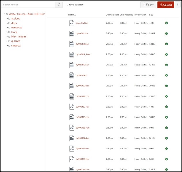
This screenshot shows the content of a folder titled "days" which contains 1-2 files for each course session, titled according to the 6-character date of the session in year-month-day format. There are other folders labeled "assigns" and "quizzes" that contain, we might assume, assignments and quizzes, respectively. Additional folders labeled "handouts" and "subjects" also presumably contain course materials, though it is not clear what each word might signify and what distinguishes the one from the other, while other folders, titled "Icons" and "Misc. Images" probably do not contain course materials, but might.
In sum, it is difficult to understand how a person is supposed to get started with this course. A step further, I built this course (many years ago), and I don't remember how a student should navigate it. In a word, the Files area is non-sequential. It puts stuff next to other stuff, but it provides little information about how those things relate to each other. Again, it is an Ikea box missing a manual – and Ikea furniture can be challenging enough to build with a manual.
If you were a student in this course, how long would you persist? And if you did eventually find your way to the course materials you were expected to complete, how much energy would you have remaining by that point? How many midnight e-mails might you send, and what might the emotional tone of those e-mails be?
Let's not belabor the point. The challenges with using the Files area to provide course navigation are clear. Instead, let's consider another not-quite-excellent approach.
Example 2: Using the Modules as a Files Area
For our next example, let's consider a way of using the Modules area within Carmen. In this example, we have taken the time to create a module for one week of the course, creating links to the course material students will need to use, and putting it in the sequence they should complete it. These are substantial steps, and they help, but only take us part of the way, as we hope this example will demonstrate.
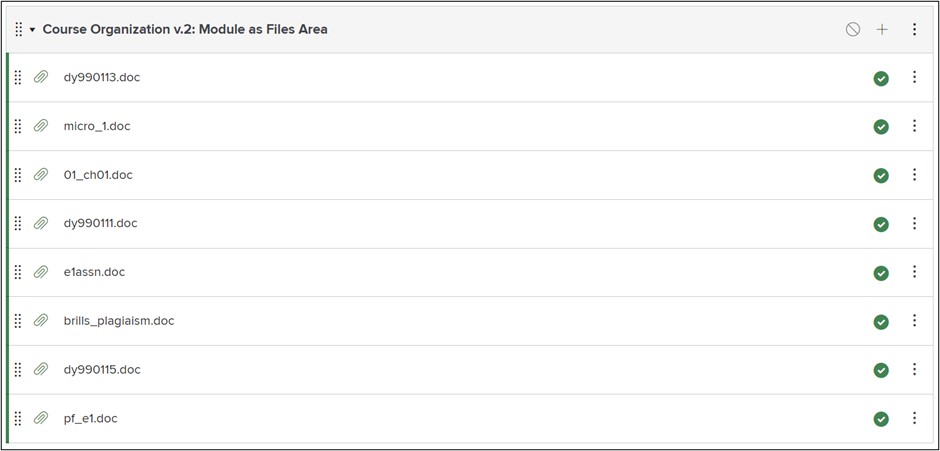
If the core principle of Intuitiveness is "don't make me think!" let's consider what kinds of thinking students would and would not need to do when presented with this kind of module.
They no longer need to think about where to find the next item, nor do they need to wonder whether they have found all the materials they will need to work on.
On the other hand, they will need to do significant work to figure out what each item is and what they should do with it. Presumably they will receive further instruction after they have opened each file, but the module itself provides no initial information. Further, this kind of navigation provides no guidance about how it all fits together. A student completing work organized like this is liable to experience it as a disconnected series of discrete challenges, rather than steps in a larger process of learning. They might miss the big picture.
Example 3: Using the Modules Properly
So how can we address these remaining problems? What does intuitive course organization look like online? The model below illustrates what we believe is an effective design for course navigation. (It is also the approach we have incorporated into our template.)
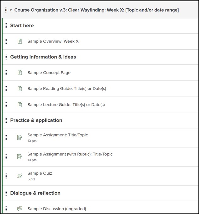
We have made two basic changes here:
- We have renamed each item to provide clear information about what students should expect to find on the other side of the link.
- We have organized the items into sub-groups and added text headers that indicate what role those items play within the larger module.
The benefits of these two changes for intuitive understanding of navigation are substantial. A student encountering this module is given a clear map that they can use to plan and execute their work. They will learn, then practice, then discuss. Importantly, the structure also provides metacognitive information that guides them for thinking about their own thinking. They are told, both explicitly and implicitly, that their learning on this subject will unfold over time and that they should expect to improve over time.
Step 5: Rinse, repeat until it feels ready to present to students.
As we said above, there is no platonic ideal of course design. There are other steps you can take that would make your modules even more intuitive for your students. There are decisions you will need to make that depend on the nature of the course and the expectations of your students. Possibly you are teaching a subject -- or one chunk of your subject -- where Dialogue & reflection are not a part of the lesson. Or where an important stage of the learning process is not captured in one of these categories.
It is also helpful to review the navigation structures you design through the eyes of each of the student personas we provided above. If you do so, you will likely find yourself recognizing that some aspects of a design would work better for some students than others. Other aspects of the design may be insufficient or even counter-productive for some students.
The key is to continue examining and improving your design until you have smoothed out the rough places and are confident that you have minimized obstacles, so that your students can focus their full energy on doing the learning you most want them to do.