Apply UXDL: The Landing Page
The Landing Page
Step 1: Abstract the situation to identify what students need most.
A student’s motivation and engagement in a course can often be impacted even before the first day of class. As soon as they enter the course in Carmen, what do they see? What kind of impression of the course does that first encounter create, especially for those novice students who may be completely unfamiliar with the university’s Learning Management System?
As we mentioned earlier, the landing page is the first thing that students encounter when they enter your course. It sets the emotional tone and provides students with key information about what they should expect from you and from the course. For this reason, it is essential that the landing page provide students with a positive experience that will motivate them to engage in, and prepare them to excel in, the course.
Research demonstrates that human beings are inherently motivated to put forth effort and to act; yet, certain social contexts and cultural or developmental influences can affect an individual’s level of motivation and even derail that motivation all together if the appropriate supports are not put into place.
Step 2: Identify the dimension(s) of UXDL that are most salient for the task.
So which aspect(s) of the UXDL framework are paramount to meet the demands of this situation, to create a positive first impression as soon as the student opens their course in Carmen? In our estimation, it is Desirability.
Step 3: Review the general principles for that dimension of UXDL and connect them to specific experiences that students will have.
The UXDL principle of Desirability (as we recall from the Overview of UXDL) consists of 4 key tenets of design:
- Visceral: People (including students) are drawn to beauty and aesthetically pleasing things.
- Behavioral: People avoid frustration and appreciate clear choices.
- Reflective: People benefit when design choices reflect and pave the way for related experiences.
- Human: People, being social animals, appreciate designs that welcome them into some manner of human interaction.
The design of any course page should not only be beautiful and functional by utilizing meaningful images, inviting colors, and clean layouts, but it should also invite students to reflect and feel connected, by way of cohesive themes, personal touches, and moments of empathy.
Step 4: Identify the corresponding features of Carmen and figure out how to optimize them for the students' actual experience with them.
Now comes "the work of the work": translating these design principles into specific decisions about the look and feel of a Carmen landing page.
Example 1: The Good or OK Homepage
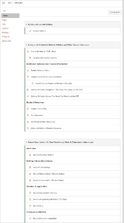
By default, Carmen directs students to the Modules page when they first enter the course, as illustrated in the screenshot below. There, students are confronted by a long list of content items and to dos, for which they have not yet been given context. Especially for novice students, this can be an overwhelming, and thus unpleasant, experience. It sets the expectation that the course will consist of an array of disconnected tasks, which they will be asked to confront with minimal guidance. Not particularly Desirable. (That is, not very beautiful, not very functional without context, of limited use for reflection, and offering little to no human connection.)
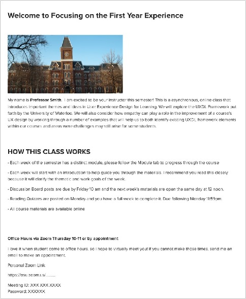
Fortunately, Carmen also makes it easy to adjust this default view by setting a Front page, or homepage, for the course. Starting with a homepage, rather than the Modules, can help to minimize some of the cognitive overload that might be created by visually seeing and scrolling through a list of tasks. It can also help to maximize generative processing by providing a space where meaningful pictures and words can be presented together and where the instructor can incorporate a more conversational style to increase the feeling of personalization and connection, both to the learning community and to the course materials. All of these are essential design elements of the Useful category of the UXDL framework.
The screenshot below is an example of what a relatively simple homepage might look like in Carmen.
Thinking about this page through eyes of the student personas, please take a moment to identify what positive design elements from the principle of Desirability you notice in this example.
As you explore this example homepage, you will likely notice some elements of the page:
- visceral beauty is enhanced by meaningful graphics, ample white space to create visual balance, and inviting colors indicated by a blue, rather than gray sky
- behavioral design is served by the clean, simple layout, along with the bolded phrases that create visual hierarchy
- human design elements appear in the form of email links that provide opportunities for interaction and a course welcome statement that intimates instructor presence and a community of learners.
Ok, now take another look, but focus instead on areas for potential improvement. Thinking specifically about the student personas, what challenges, if any, might still exist for those students with this design? And what could be done to resolve them?
Some of the opportunities we observe include:
- Adding some brief instructions or clearly identifiable links to let students know how to access the actual course content
- Bolding key instructions to make scanning the page more efficient and easier
- Incorporating or repeating key links like an email address, syllabus link, office hours link, etc.
- Adding some visual sign posting to segment the topics
All these changes would make this page more desirable and much more useful, intuitive, and accessible for most, if not all, of the personas that we are working with today. And many of these elements can be done using standard Carmen tools provided in the Rich Content editor.
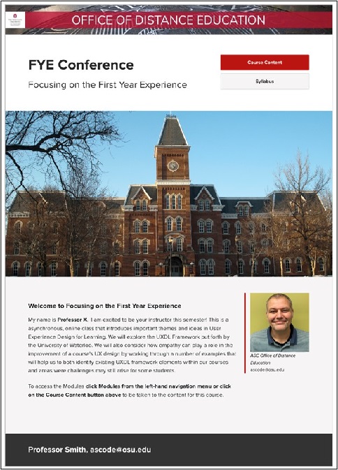
Examples 2 & 3: Better and Better Homepages
Now that we have identified areas for improvement, what might other versions look like?
After seeing this re-designed example, how many of you (again thinking as a student) would be more engaged by this second design compared to the first? Raise your hands.
Some clear differences between the two examples include:
- A variation of layouts to keep visual interest
- Clearly defined clickable areas via buttons
- Bolded instructions help with visual scanning Adding an instructor profile image incorporates human connection and personalization
- Consistent and meaningful color schemes enhance both visual beauty and the reflective design of the page.
A still better version might look something like this.
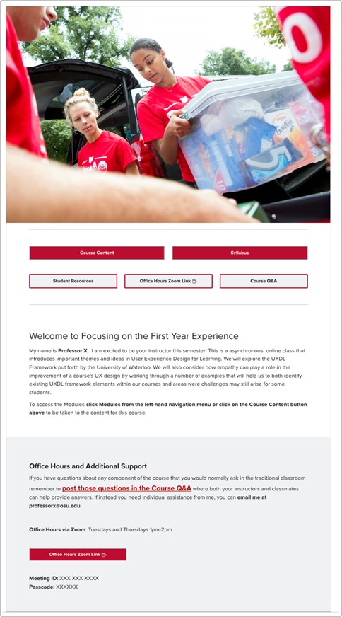
- The picture is even more energetic and welcoming, featuring active students engaged in what seems to be a team-based helping activity.
- The links are more extensive and tailored to the needs of novice students, emphasizing opportunities for help and making them immediately available.
- Those offers of support are repeated and reinforced, indicating that they are sincere offers based in authentic concern for student well-being.
Note that not all of these changes are necessarily improvements. For novice students, we believe they are enhancements, but they might not suit your course or convey the impressions you want to convey.
Step 5: Rinse, repeat until it feels ready to present to students
At this point, we have reached the rinse, repeat level of design, where decisions are less about solving problems and more about choosing among plausible alternatives.