Apply UXDL: The Syllabus
The Syllabus
Step 1: Abstract the situation to identify what students need most.
Is there anything in higher education that is simultaneously more important and more overwhelming for novice students than a course syllabus?
The syllabus is a perennial challenge, especially for new students unaccustomed to interpreting the multi-page, quasi-contractual documents that govern their courses. Given the importance of the document for their success -- it literally describes policies that can result in their removal from the university -- the importance of good design is tremendous.
As a design challenge, it is particularly challenging because of the need to provide an immense amount of information. The university requires that the syllabus include several pre-determined sections, often including precise language. Further, college courses are just complicated rule-sets, as confusing to newcomers as they are familiar to those with long experience.
So what are we to do? And how can UXDL help us identify ways to help students make sense of this large amount of complex information?
Step 2: Identify the dimension(s) of UXDL that are most salient for the task.
In terms of UXDL's categories, we believe that the syllabus is a classic Usability design challenge. Students need to use the Syllabus, while the large amount of information makes that difficult by hindering our ability to guide students to the most useful knowledge for accomplishing the tasks they need to accomplish. Fortunately, the UXDL framework provides really valuable insights for designing with usability in mind. (Note: as we will see, there are also significant navigation challenges with the syllabus, so the principles discussed above will also help here.)
Step 3: Review the general principles for that dimension of UXDL and connect them to specific experiences that students will have.
Let's begin by reviewing the principles that the UXDL framework advises for improving Usability:
Minimize distraction
- Leave out unnecessary bits
- Point out important bits
- Avoid duplication
- Place related bits close together
Help learners process
- Preview main concepts
- Use shorter chunks
- Where possible, enable users to decide how to view the information
Construct a model/schema
- Pair words with pictures
- Employ a conversational style
- Humanize learning
- Demonstrate with worked examples
Retrieval practice
- Provide opportunities for users to test their comprehension and memory
To illustrate the principle of Usability in action, our colleagues at the University of Waterloo provide a graphic illustration which presents the same basic information:
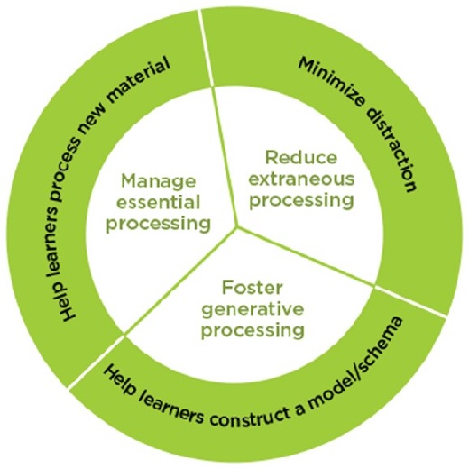
And what we see when we remove the clutter is that the principles of UXDL usability are fairly simple:
- Minimize distraction (by eliminating the unnecessary, highlighting the important, and arranging things so that things only appear once, close to related things)
- Help learners process (by starting with a preview, enabling users to control what they see)
- Construct a model/paradigm (that is, convert 10,000 facts into one clear framework)
The online design principle can be illustrated by an analogous design problem in the physical world. Some years ago, a very organized colleague told me the story of how he set out to perfect the organization in his family's refrigerator. After a couple of hours of false starts, he was completely stuck, sitting on the floor surrounded by warming food, until his spouse rescued him with the wise insight: "Bryce, not everything can go in front."
Your students' attention, like the front row of a refrigerator, is limited, and not everything in the syllabus can "go in front" at the same time. Usability in this context means not giving students more than they can use at once.
Step 4: Identify the corresponding features of Carmen and figure out how to optimize them for the students' actual experience with them.
So how do we put this insight into practice when putting a syllabus online for students in Carmen? Let's take a look at some alternatives.
Example 1: Using the Word version of the Course Details Template
For version one, we have a bare link to the Word version of the DL Course Details template.
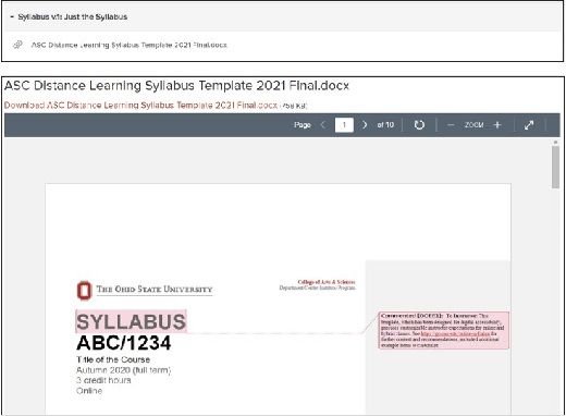
To see the full document, you can download a copy of the ASC DL Course Details template.
From a design perspective -- and we want to be clear that we are only talking about the design here -- several of the students described in our set of personas seem likely to encounter usability challenges.
There are positive features: the headings in the document, as well as its sequence, help indicate structure and importance. The most crucial information -- the key details of how to attend -- are featured up front. The fonts and layout lend themselves to reading and incorporate open spaces to reduce information density.
It remains, however, a wall of information, and the sheer number of details and sections make it difficult to process, whether in a single pass or to find a specific policy. If, for example, we imagine a novice student attempting to understand what counts as academic integrity for this course, it is difficult to know how much effort it would take to answer that question.
Example 2: Use the Carmen Syllabus Page
For the second example, we have adapted Carmen's built-in Syllabus tool. We provide the same link to the full syllabus as in Example 1, then also use the page's Rich Content Editor to highlight key information
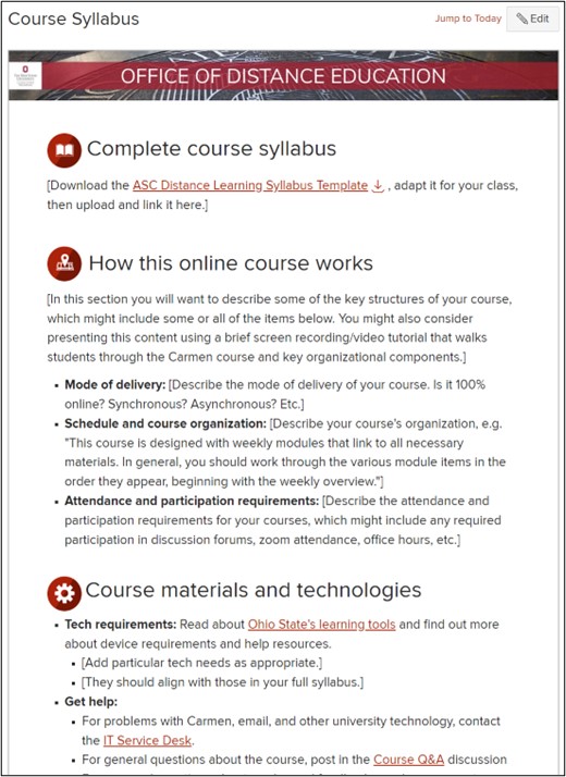
Some immediate benefits are clear. The Syllabus page inherently provides an opportunity to foreground the most crucial course information -- to "put it in front" -- while still providing a link to the full syllabus. Also, while not visible in this screenshot, the Syllabus tool in Carmen automatically displays a list of all the assignments due in a course: any activity that has points attached or that you have specifically designated will display here. If you specify due-dates for these items, Carmen will even list them in chronological order. This feature separates the Course Policies from the Course Schedule, helping students understand the different sets of requirements. Note, too, that we have added icons to the section headings in this layout, providing more intuitive divisions among the sections of the document.
That said, the Syllabus Tool in Carmen remains a limited feature. Among other things, it presents only a single text box for displaying information. While possible to highlight one subset of content, this solution does not make it possible to provide students with full control over their navigation of the document.
Example 3: Some Brief Wrong Turns
What else might we do?
When faced with a large amount of information and limited attention, it is tempting to turn to the power of interactive hypertext to solve the problem. Tools such as javascript make it possible -- not easy, but possible -- to set up a web page so that it displays differently depending on where a student clicks. Two examples are Accordion text and Tabbed text. (In the former, clicking on a heading will cause the text below to appear or disappear. In the latter, all the text of the page is organized in blocks beneath a row of headings; clicking on one or another heading will cause the associated text to appear.)
The apparent benefits for usability are obvious. This would seem to solve the problem of "not everything can go in front" by enabling the user to decide for themselves what goes in front.
Unfortunately, while better for some users, these solutions -- as they currently function -- create even larger obstacles for other users. Specifically, dynamic text such as accordioning and tabbed paragraphs fail catastrophically for some disabled students. Screen readers may present them in chaotic order, for example, and some students with mobility issues may have difficulty making the page work as intended. Further, for students viewing your course on their phones, accordion- and tabbed-text may simply not display.
We highlight these "wrong turns" to emphasize two points. First, design is an iterative and complex process, which involves balancing multiple demands and considering different options until you arrive at what seems to be the most elegant solution for the situation. Second, online courses make it possible to include students who have not been able to attend previously, but ensuring their inclusion requires ongoing attention to potential challenges that might not be immediately obvious.
Example 4: Supplementary Materials in an Orientation Module
Examples 1 and 2 are fine. They will work. Students can view the syllabus in either of those ways. There are, however, better options. And especially when novice students are involved, it is worth the effort to take the extra steps to maximize usability by minimize cognitive load.
Here, we will demonstrate how to include a dedicated module that recapitulates segments of the syllabus as individual pages. (We recommend that this supplement, rather than replace, the use of the Syllabus page within Carmen, since students will expect to find the syllabus information by clicking on the word Syllabus and may be confused or frustrated if they need to search for it elsewhere.)
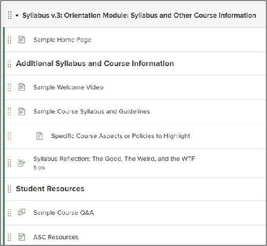
Note that, in addition to sections of the syllabus, this supplemental module enables you to incorporate activities that will help students process and retain the information from the syllabus. One principle of Usability (which we have not said much yet) is to provide retrieval practice: that is, to design the flow of information in such a way that the recipient is required or encouraged to engage with it, rather than merely hear or see it. In this example, we show a "Syllabus Reflection" activity, which leads to an assignment where students are asked to describe the parts of the syllabus they find most important, most surprising, and most confusing. Even that shallow level of processing is likely to improve their memory of the syllabus, while simultaneously providing you information about how the information has been perceived by your students.
Step 5: Rinse, repeat until it feels ready to present to students.
Ultimately, there is no magic bullet for communicating the full information covered in a modern syllabus to students, especially students new to university-level learning. By addressing the situation as a design challenge, however, we hope we have demonstrated that it is possible to continually improve the presentation of the syllabus.