Composing Accessible Alt Text
Images embedded into your content can provide vital signposts and add interest to your design for users. Particularly for users with cognitive disabilities or low vision, images can be crucial to increasing intelligibility of the material you are trying to share. But it is important to remember that while this content is pleasing and helpful for some, it may not be accessible to others.
When designing content, whether it’s informative, instructional, aesthetic, or otherwise, it is important to include alternative attributes—specifically alt text—for embedded images and graphics. Most web design tools (such as Carmen, Drupal, and the WordPress supported blog sites which are used here at Ohio State) include the ability to add alt text at the same time you upload the image. But if you are building it into a document, you will need to be mindful of locating the right place to add alt text. For example, if you are working with a PDF document you can add alt text using Adobe Acrobat Pro in three easy steps:
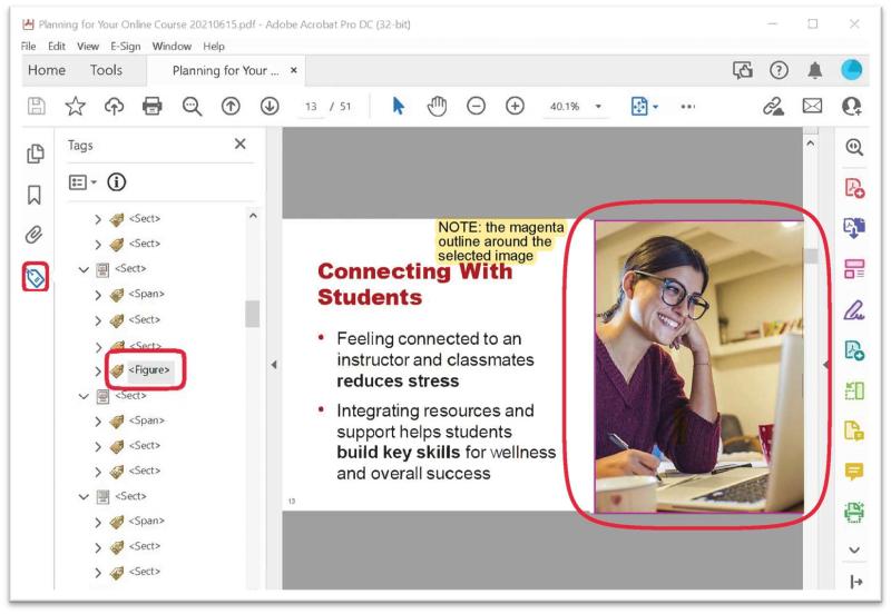
- Open your PDF and select the “Tags” option from the Navigation Panels list on the left-hand side of the screen. This will open the Tags Tree. (Figure 1)
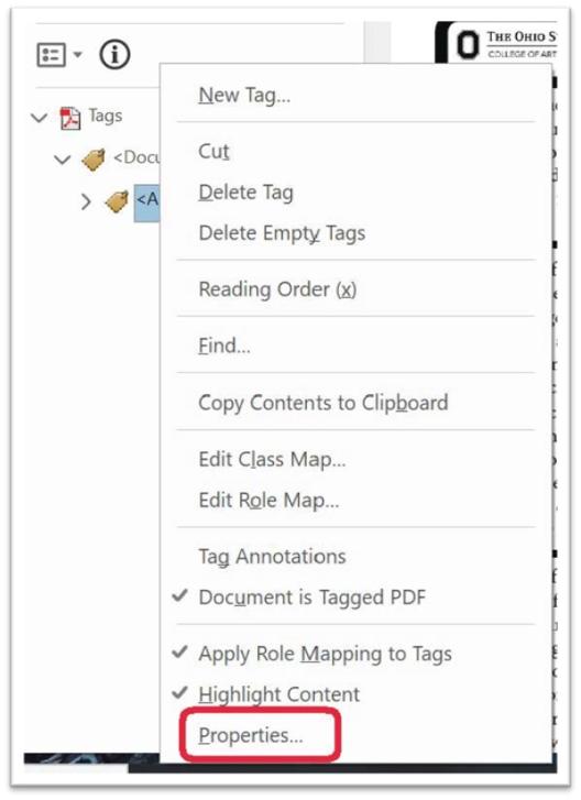
- Within the Tags List, identify the <Figure> you want to add alternative text to, right-click on it, and choose the “Properties” option from the menu that appears. (Figure 2)
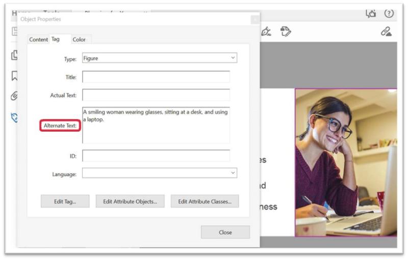
- This will open an “Object Properties” box. Type your descriptive text into the edit box labeled “Alternate Text.” Select “Close” to save your alt text. (Figure 3)
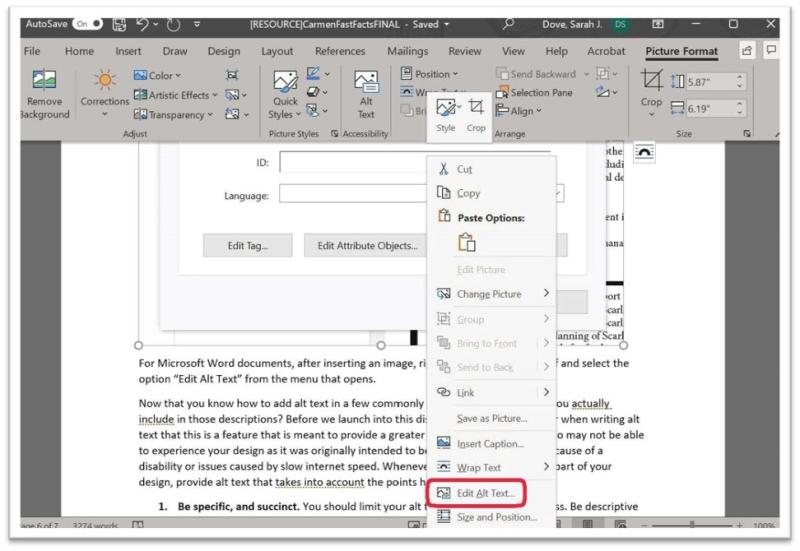
For Microsoft Word documents, after inserting an image, right click on the image itself and select the option “Edit Alt Text” from the menu that opens. (Figure 4)
Now that you know how to add alt text in a few commonly used places, what should you actually include in those descriptions? Before we launch into this discussion, always remember when writing alt text that this is a feature that is meant to provide a greater level of access to those who may not be able to experience your design as it was originally intended to be experienced, whether because of a disability or issues caused by slow internet speed. Whenever possible, if images are a part of your design, provide alt text that takes into account the points here:
1. Be specific, and succinct. You should limit your alt text to 120 characters or less. Be descriptive in what the image includes, especially if it references keywords that are relevant to the subject matter, but don’t get carried away with flowery interpretations that might lead people astray from what the image actually depicts.
2. Don’t start with “image of…” The fact that what you are describing is an image is already assumed in the use of alt text. However, if it aids in your description to differentiate between cartoons, photographs, graphics, logos, portraits, or the like, this could be good, descriptive information to include.
3. If the image has text, include it! This could be the primary focus of the image you are describing, or it could be included in a signpost, poster, or other insignia. If it is significant to the image, you should always include it.
4. Compose as a complete sentence. Abbreviations and shorthand are not appropriate for alt text. The point of alt text is to provide greater access and truncating your descriptions does not help to do this.
5. Differentiate from caption text. If you have included a caption for your image, make sure your alt text is different. Best practices for accessibility suggest that any time you include media you should include a short, descriptive caption. Using the same descriptions for alt text and captions creates an unnecessary redundancy that is best to avoid. Make the effort to make a differentiation, while making sure not to leave anything important out of either which would result in an unnecessary exclusion for some individuals.
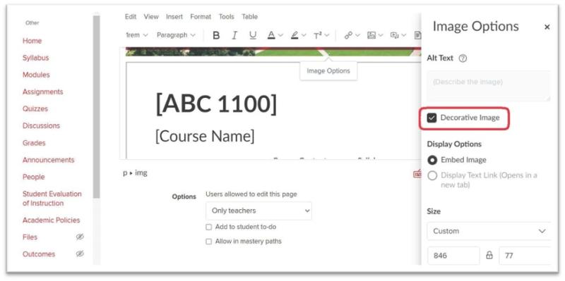
A few more things that are helpful to remember: many programs will let you mark an image as “decorative” to circumvent providing alt text. (Figure 5) If your image truly is just decoration, it might be best to ask why you have chosen to include it. If it is a part of your design, there must be some significance to including it. And if that is the case, it is important to include carefully crafted alt text.
As with many facets of accessible design, it is best to prepare for this part of the process from the outset so that you don’t have to backtrack in your design and so that you can avoid unnecessary frustration in having to do more work on a design that was considered complete.
If you have any concerns about whether you are on the right track with composing alt text or captions and want someone to review your work, the ODE instructional design team is here to help. Schedule a consultation with us today!