Utilizing the Accessibility Checker
As more and more content moves into the digital sphere, even for in-person courses, there is an increased responsibility to ensure that content is as accessible as possible for all users. But you can breathe easier knowing that Carmen has a built-in tool that will aid you in checking accessibility as you build your course.
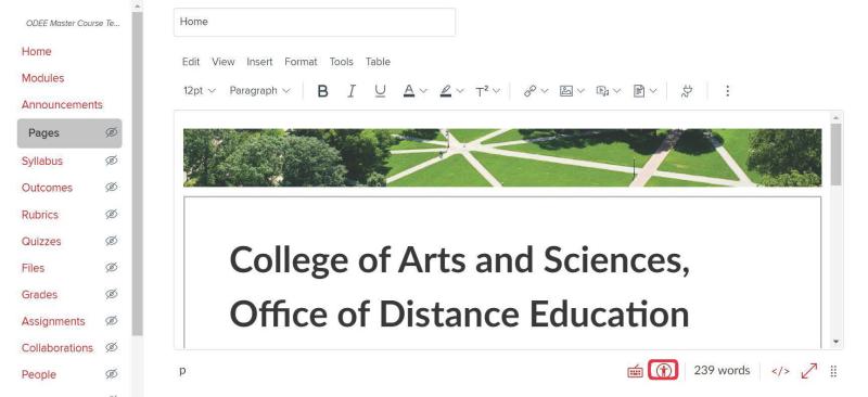
The Rich Content Editor, used for editing all pages and descriptive text within your Carmen course, contains an Accessibility Checker tool. Just below the content editor box field is an icon of a stick figure within a circle that, when clicked on, will provide an accessibility report. (Figure 1)
While the Accessibility checker itself is not new, a recently introduced feature of the Accessibility Checker is that it alerts you by turning a bright orange color with a numerical notification when you have an accessibility error. This tool is not entirely comprehensive in guaranteeing perfect compliance with OSU’s Minimum Digital Accessibility Standards (MDAS), but it does catch 12 types of web accessibility errors.
Here is a list of what this tool catches and what can be done to amend the error to help you on the road to meeting MDAS:
- Table captions. Tables should include a caption describing the contents of the table.
- Table header. Tables should include at least one header. Headers should be succinct and provide context to readers for what is to follow.
- Table header scope. Table headers should specify table structure. Fixing this error means making sure your headers clarify what the table includes. and should alert readers about the table structure.
Note: Tables should never be used solely to present images of other purely visual material. If you are interested in learning more about how to build accessible yet visually pleasing grids that will satisfy more aesthetic design needs, schedule a consultation with an ASC ODE Instructional Designer using this link.
- Sequential heading. Heading levels should not be skipped (e.g., H2 to H4). However, the tool does not check if the first header starts with H2 or whether the headings are sequential with the rest of the content in the page. When in doubt, start with H2 and adjust font size, using subsequent heading levels for subheadings that should appear. Heading level H1 is designated for the page title.
- Headings. Headings should not contain more than 120 characters. More than 120 characters will trip an error.
- Image alt text. Images should include an alt textual attribute describing the image content. These should provide succinct descriptions, while giving readers enough context about the image to understand what it is.
- Image alt filename. Image filenames should not be used as the alt attribute describing the image content. Files uploaded directly to Canvas may have file names that include shorthand and do not describe the content well. Correcting this error means providing detailed and succinct alt text.
- Image alt length. Alt attribute text should not contain more than 120 characters. For more tips on composing alt text, see Fast Fact #5: Alt Text.
- Adjacent links. Adjacent links with the same URL should be a single link. This error identifies link errors where the link text may include spaces, thus breaking a single link into multiple links.
- Lists. Lists should be formatted as lists. When in doubt, use the pre-formatted bulleted and numbered list options found in the rich content editor. Note: lists where order is important should use numbers, while those where order doesn’t matter should use bullets.
- Large text contrast. Text larger than 18pt (or bold 14pt) should display a minimum color contrast ratio of 3:1.
- Small text contrast. Text smaller than 18pt (or bold 14pt) should display a minimum color contrast ratio of 4.5:1.
For these last two items, here’s a link to an online contrast checker. You will need either the HEX or RGB numbers for the colors you wish to use to check them. You can find that info using the Color Picker in the rich content editor.
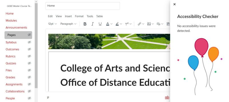
Once you’ve been through and repaired any accessibility errors that the Accessibility Checker prompts you to fix, you should get a celebration screen that informs you that everything is in good shape. (Figure 2)
It is important to take into consideration OSU’s Minimum Digital Accessibility Standards (MDAS). Here at OSU, our MDAS comply with Web Content Accessibility Guidelines (WCAG) 2.1 at a conformance level of AA.
If you’ve read that last sentence and haven’t a clue what you were meant to get from it, we understand—many of these requirements are only just being broadly circulated throughout our institution. But it is important to note that within this technical jargon is an expectation that instructors should try to familiarize themselves with ways that they can ensure that any course material shared with students in their Carmen courses follows these standards. If you’re interested in reading more about OSU specific policies, follow this link!
There is a lot to learn about digital accessibility and even more to learn about doing it well. We know that accessibility compliance can require a lot of attention and time invested. If you have any questions or concerns about the accessibility of your course materials, we are here to help. Click here to schedule a consultation with an ASC ODE instructional designer.